Commerce7 has acquired WineDirect's SaaS division. Learn More
Behind the Making of an Even Better Checkout Experience
Andrea Dyck 7 min
Sep 1, 2021With the number of retailers and options that consumers have online today, when a consumer has made the decision to purchase your product, we want completing Checkout to be as easy as possible.
In Commerce7, your existing customers can already complete Checkout with a single click, but what about first time customers? In 2020, we saw that 37% of online purchases were made by new customers and we knew there was an opportunity to optimize the experience even more.
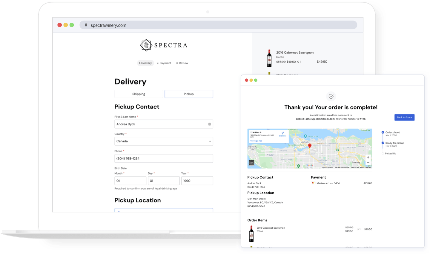
With the latest version of our website tools, we’ve reviewed the checkout process from start to finish, reducing the number of required fields to just 10! We’ve also made adjustments to each step to improve the overall usability. It’s not enough to just tell you that we’ve made improvements, we want to take you through some of the key changes to show you how they benefit both you and your customers.
Faster completion time
18% of carts abandoned during Checkout are due to the process being too long or complicated. We’ve made some improvements to make Checkout even faster, that’ll not only help reduce abandoned carts, but will also improve the experience for users on mobile devices.
Smarter field entry
Based on the customer’s Zip Code, we now automatically detect their City and State.

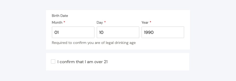
If your State doesn’t require a full birth date, we only require a simple checkbox confirmation as opposed to the full birth date.
Reduced number of fields
We are only requiring customers to enter the details that you absolutely need. Every field removed means a higher conversion rate for you. For shipping orders, we’ve reduced fields by up to 37.5%, and for pickup orders, fields are reduced by up to 63.6%.
We’ve combined First Name and Last Name into a single field which means one less field for your customers to complete.

Did you know that a Billing Address isn’t actually needed to verify the validity of a credit card? Having it does help reduce fraud, but at Commerce7 we’re doing this in other ways instead of making your customer fill out those 10 extra fields.
Optimized field types
Cart quantities
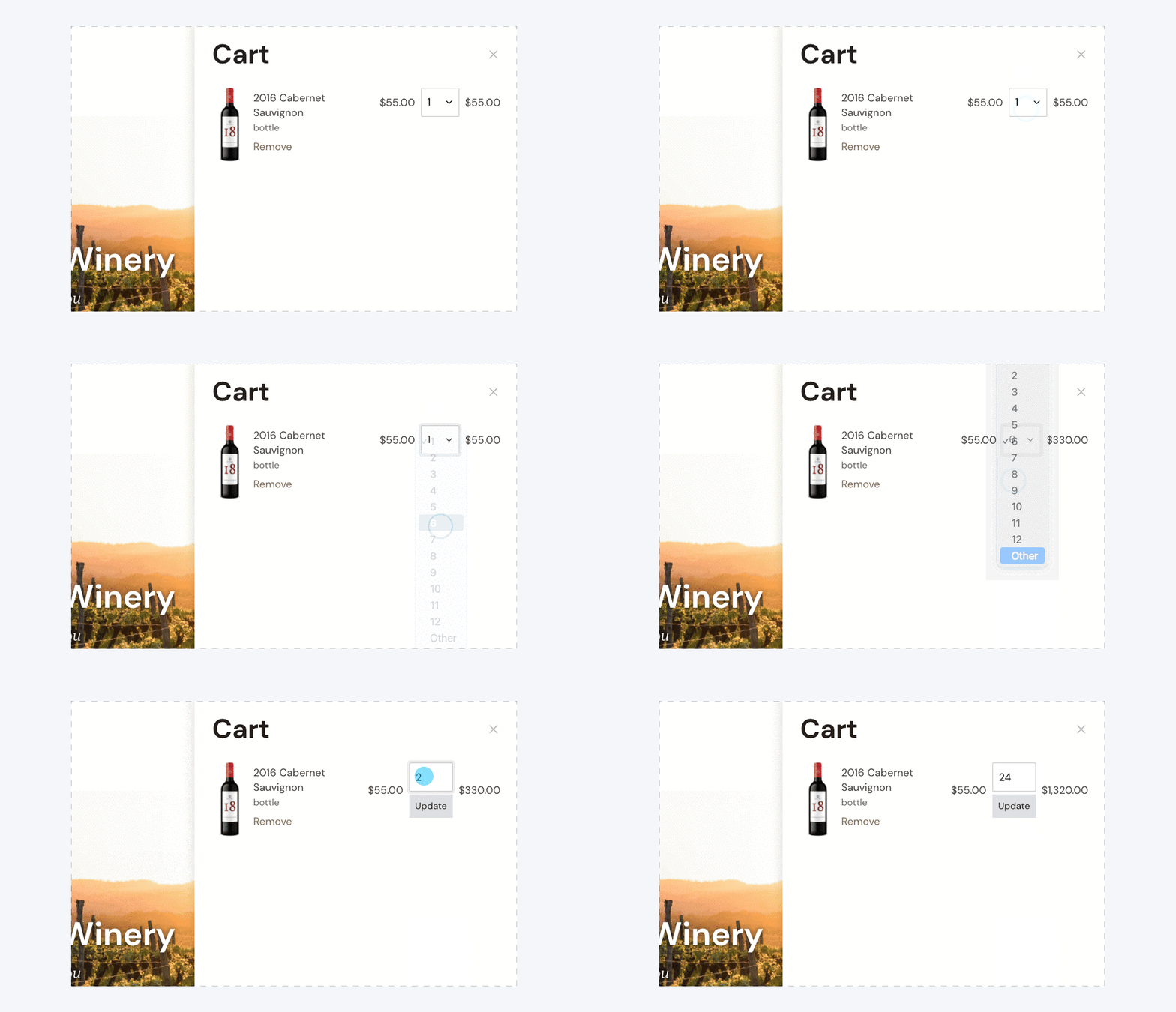
When a customer is updating the quantity of an item in their cart, we now display a dropdown that automatically saves once a number is selected. This is not only quicker, but will help reduce mistakes removing the need for customers to manually save each edited product quantity. For quantities over 12, to avoid having a list that’s as long as the Nile, we’ve added an “Other” option, which will change the field type and allow them to enter whatever quantity they want.
Pickup locations and customer addresses
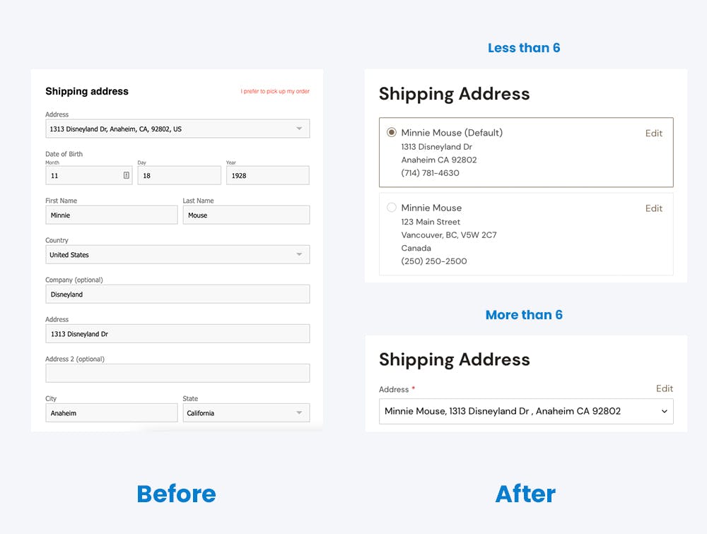
For each checkout option, depending on how much information you’re displaying, there’s an optimal way to showcase it so that it’s easy to interact with. For example, if your customer has 4 addresses to choose from, it’s better to display them all at once, saving time and reducing the number of clicks. On the other hand, if your customer has 10 addresses on file, it’s better to keep them in a dropdown.
We now dynamically update the field type for pickup locations, customer addresses, and customer credit cards based on how many options there are to choose from.
Credit card entry
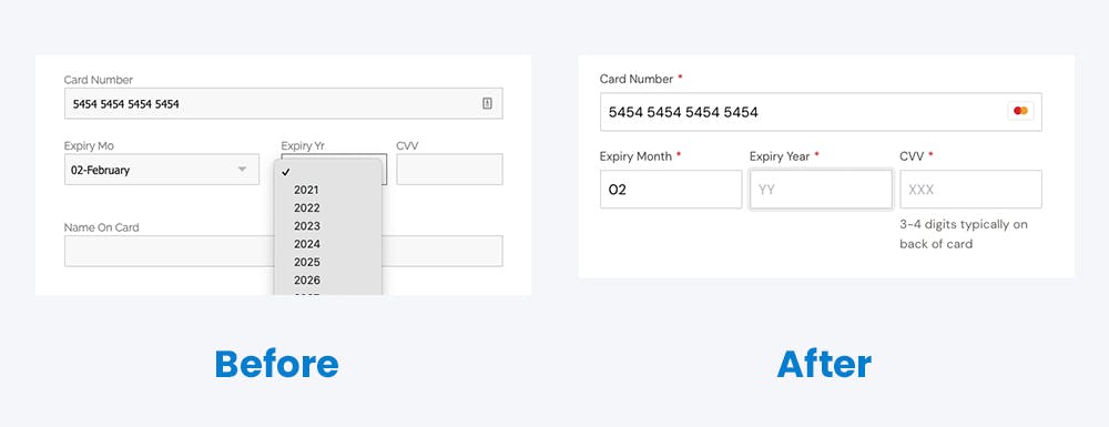
The fields for credit card expiry now accept 2 digits that can be quickly typed in, as opposed to the dropdown that is used in version 1. This creates a much faster experience for your customers, especially on mobile where dropdowns can be a major pain point.
Less thinking for your customers
The less time it takes to complete Checkout, means a lower chance of cart abandonment. We want forms to be as self explanatory as possible.
More prominent Shipping and Pickup options
You’ve given us feedback that customers couldn’t easily find the option to pick up their order, and we hear you. While Shipping is still set to be the default, we’ve given Pickup a little more love and both options now display as selectable buttons.

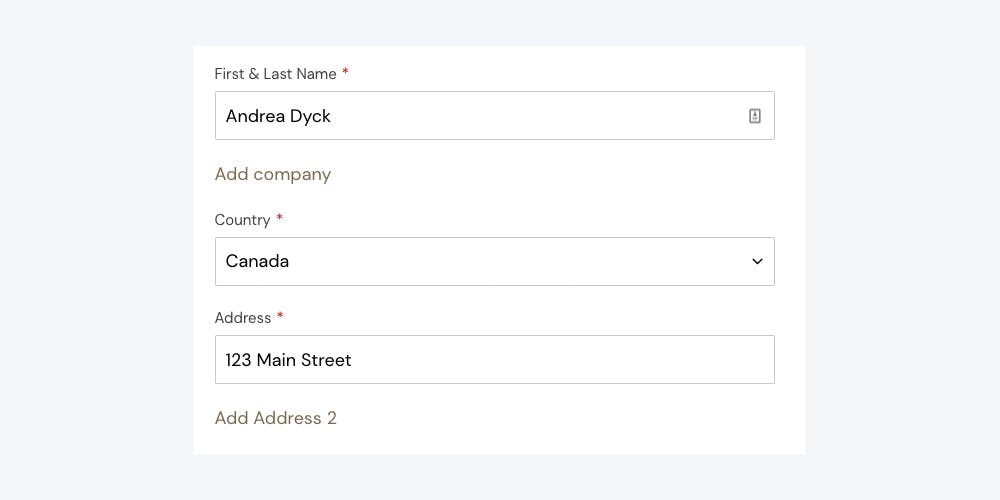
Required and optional form fields
We’ve marked all required fields allowing customers to see exactly what they need to complete before moving on to the next step. In a study done by Baymard Institute, 32% of users had an error during Checkout because required fields weren’t completed.
So that it's even easier to see what exactly needs to be filled out, optional fields are also collapsed by default, but can be expanded with a single click.
Help text
Descriptive text has been added to form fields that commonly cause a little confusion. We want it to be clear for customers what’s needed of them and why to reduce any hesitation.

Streamlined checkout steps
The entire checkout process should feel simple and seamless every step of the way.
Review step
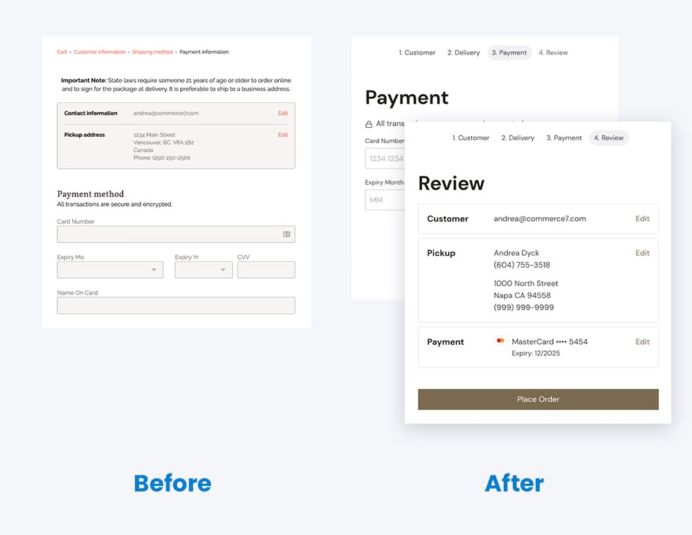
In any scenario, we know that tasks are most successfully completed when there are less distractions around (we’re looking at you Netflix). This is why, instead of having a summary of entered information on each step of the Checkout process, we’ve added a new “Review” step, allowing customers to better focus on filling out the form in front of them while still giving them the option to double-check and edit any information before finalizing their purchase.
Inline login
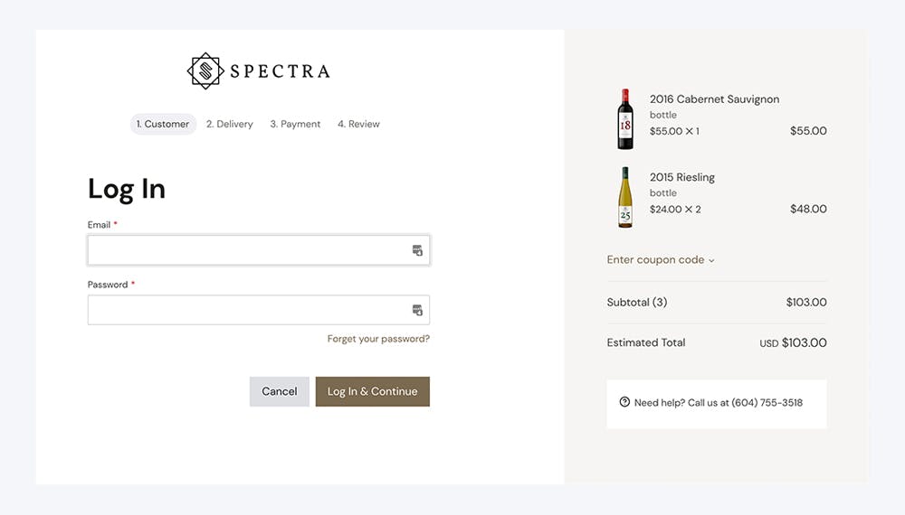
We’ve also changed how users log in during Checkout. Instead of being sent to a new page, they’ll now be kept on the same Checkout screen so that they don’t break focus.
Customizable order confirmation
In Version 2 of Checkout, developers will be given the ability to integrate apps to the order confirmation page, opening up possibilities to give you more control over the post-order experience.
Friendly reminder
While there are some pretty great improvements in the latest version of Checkout, here are a couple of ways that the Commerce7 Checkout was already the bomb dot com.
- Carts are saved across devices, meaning that when you start adding items to your cart on one device, you can pick up where you left off on another.
- Existing customers can use our One-Click Checkout. When a customer is ready to check out, we have all of their information on file and all they have to do is click a single button to complete their purchase. Talk about easy!
- We don’t require new customers to create an account. This means less friction, which means higher conversion.
- Form auto-complete makes Checkout quicker to fill out and instant validation provides your customers with better context for any errors and what they need to do to resolve them.
Learn more about all of Commerce7’s ecommerce tools.
Thanks for reading! If you have any comments or questions, you can email me at andrea@commerce7.com.
If you’re already a Commerce7 client and don’t see the updates on your website, it’s likely that you’re still on version 1. Work with a designer to upgrade your website to version 2 or to get more information, you can contact us at support@commerce7.com.
Ready to create better shopping experiences?
See Commerce7 firsthand by scheduling a demo with our team.
Schedule a Demo