Commerce7 has acquired WineDirect's SaaS division. Learn More
What Makes a Great Online Wine Club Sign Up Experience?
Commerce7 Team 9 min
Mar 19, 2024We've all been there – discovering a winery that piques your interest. You browse their website, learn their story and discover their wine club. The excitement is real until you encounter a club sign-up process that rivals the thrill of filing your taxes.
It's safe to say that a well-designed signup process shouldn’t be overlooked. After all, it's usually the first interaction potential members have with your wine club, and it sets the tone for their entire membership experience. Think of it as the front door to your winery – you want it to be inviting, easy to navigate, and welcoming to all who approach.
So, what exactly makes for a great online wine club sign up process? Let's break it down.
Highlight the Product
A study by Justuno shows that 93% of consumers consider visual appearance to be the key deciding factor in a purchasing decision. Why? Because highlighting the product not only grabs visitors' attention, but also helps them visualize themselves enjoying the product, creating a desire to make the purchase.
Similarly, starting your club sign up by highlighting the product allows potential members to see exactly what they’ll be receiving and helps them visualize the value of joining your club. By leveraging the appeal of your wines, and offering a visual experience up front, you create a more appealing offer that will resonate with potential members and inspire them to take action and complete their sign up.
Minimal Form Fields
When it comes to signup forms, taking on a less-is-more approach can have a significant impact. By only requesting necessary information, you streamline the signup process and minimize friction for potential members. Keeping fields to a minimum not only reduces the time and effort required to complete the form, but also increases the likelihood of conversions. After all, every extra form field presents another potential roadblock to membership.
Take a look at a study conducted by Jotform that analyzed if form length impacted conversion. Spoiler: It did! To find the conversion rate, the percent of form views that resulted in payment submission was calculated, and in the chart below, you'll find the conversion rate for forms with lengths ranging from less than 5 to more than 50 fields:
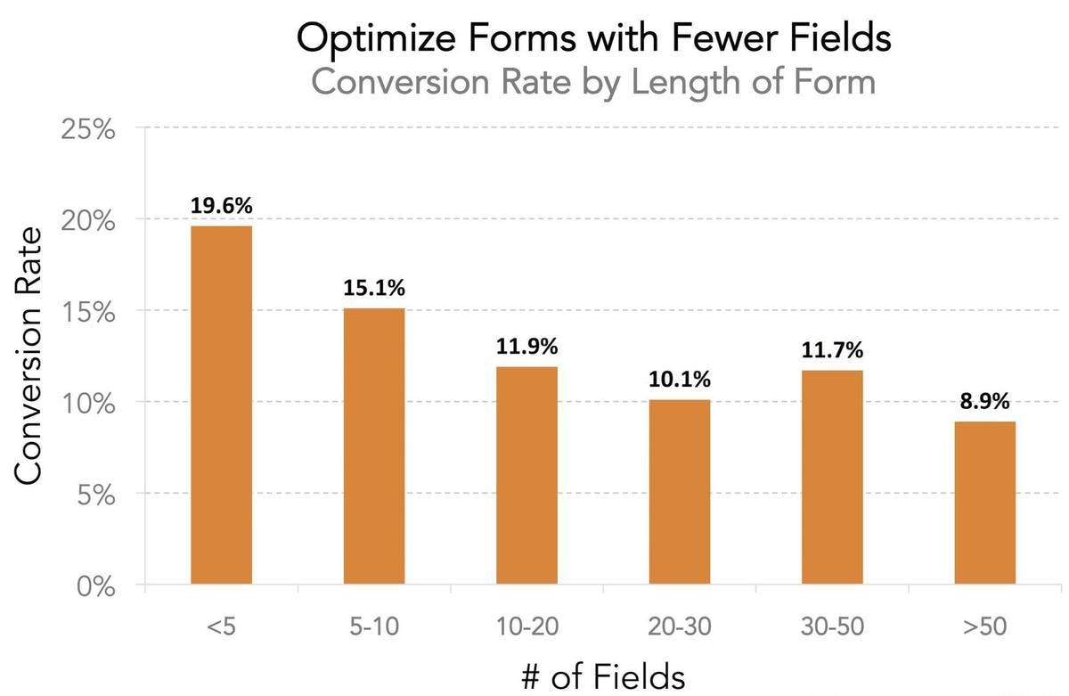
When forms had fewer than five fields, nearly 20% of users reached the checkout. However, as more fields were added, conversion rates declined steadily. For forms exceeding 10 fields, only 12% of users completed payments.
Needless to say, wineries aiming to boost their club sign up conversions should aim for shorter forms. By prioritizing simplicity and efficiency, you can remove unnecessary barriers and create a more user-friendly experience for potential members. Remember, the key to increasing conversions lies in minimizing friction and making the signup process as effortless as possible.
Flexibility and Convenience
A good club signup process online should prioritize simplicity, flexibility and convenience to ensure a smooth and positive experience for potential members. According to research by the National Retail Federation, 52% of consumers say that half or more of their purchases are influenced by convenience, and 83% say convenience is more important now compared to 5 years ago. Consumers are increasingly prioritizing convenience while making purchases, expecting retailers to offer innovative ways to save them time and effort, and wine clubs are no exception!
This emphasis on convenience highlights the importance of creating a seamless signup process for potential members, but convenience doesn't stop at signup – it extends to the club experience itself. Members want flexibility and control over their subscriptions. They want to be able to customize their orders, adjust shipment frequencies, and easily manage their account preferences. After all, who wants to commit to a club that doesn't offer flexibility, and is more of a hassle than a luxury?
As potential members navigate through the signup process, it's important to emphasize the convenience and flexibility of the club at every step. Whether it's through clear messaging, visual cues, or interactive features, make it abundantly clear how joining your club will make their lives easier. Highlight the benefits of customization, stress-free management, and hassle-free cancellations. By doing so, you not only attract more signups, but also set the stage for a positive club experience for your members.
Online Wine Club Sign Ups: A Comparison
OrderPort
The club signup process on OrderPort starts with requesting an email address but then transitions into mandatory account creation, which might inconvenience potential customers who would prefer to have the option to proceed as guests.

This mandatory account setup requires the creation of a password and extensive billing information, including 15 mandatory fields. The inclusion of outdated requests such as fax numbers and fields like a second phone number, secondary address, "how did you hear about us" survey, and a recaptcha unnecessarily complicate the signup process. While information about where the potential member heard of the winery may be useful, its inclusion in the signup process adds barriers, potentially leading to a drop in sign-up completion and conversions.
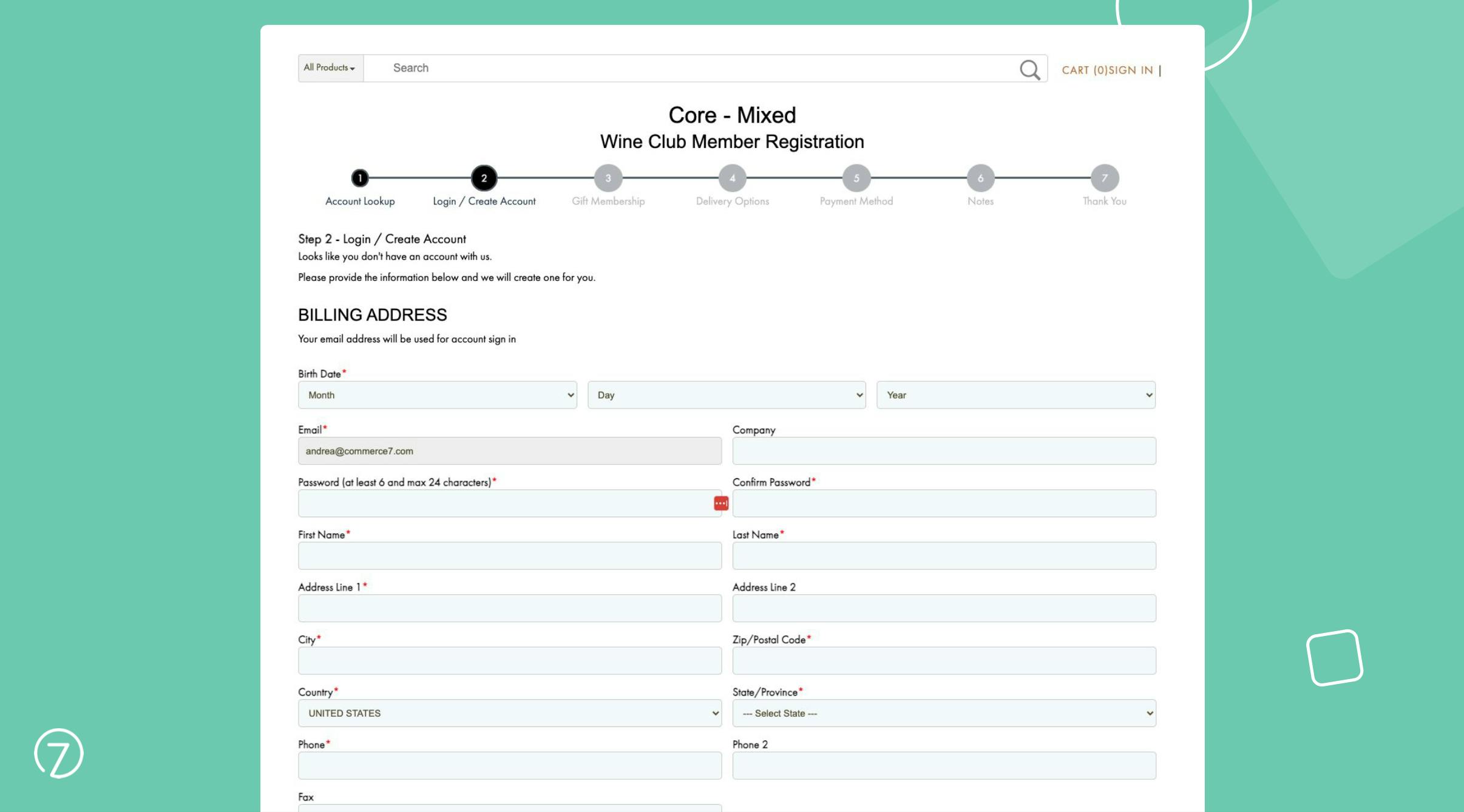
Unfortunately, as you proceed through each step, there are no products or club benefits on display to remind consumers of what they are signing up for, missing out on an opportunity to generate excitement and incentivize customers to complete their signup.
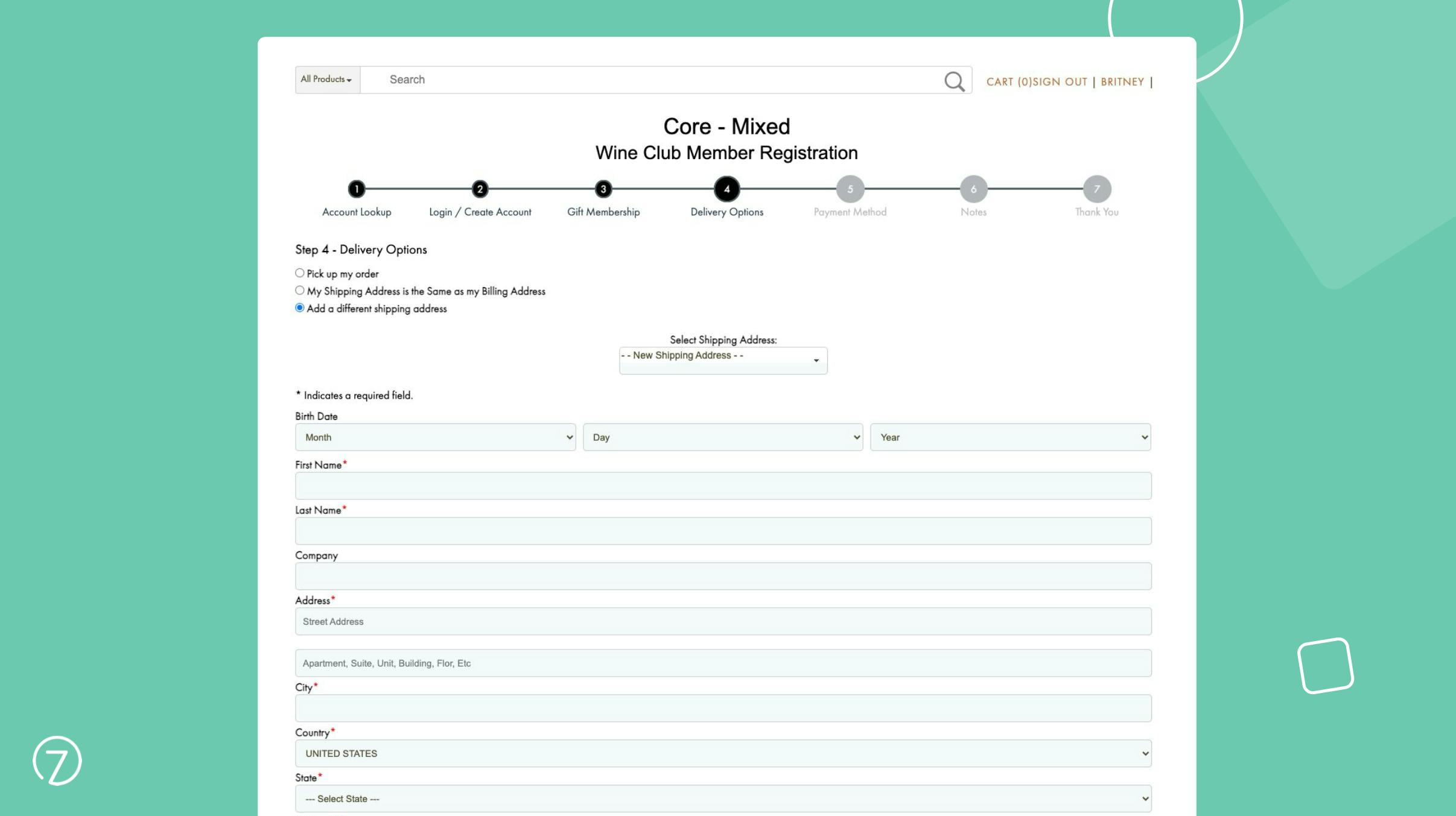
Overall, OrderPort's club signup experience could benefit from improvements to enhance user-friendliness and efficiency, aligning more closely with modern expectations for online interactions. By simplifying the signup process and focusing on essential information, OrderPort could create a more seamless experience that encourages greater participation and conversion rates.
WineDirect
WineDirect's club signup process offers a fairly standard experience for users. It begins by prompting users to create an account or proceed as a guest, providing some flexibility.

However, as users progress, they may encounter a slight inconvenience when it comes to their shipping and delivery information. There is a relatively high number of 11 mandatory fields, which could be seen as excessive.
With that said, WineDirect does introduce an outline of what the club offers, including the benefits the potential member can expect in this step, and all subsequent steps, which is a great tool to help encourage signup completions.
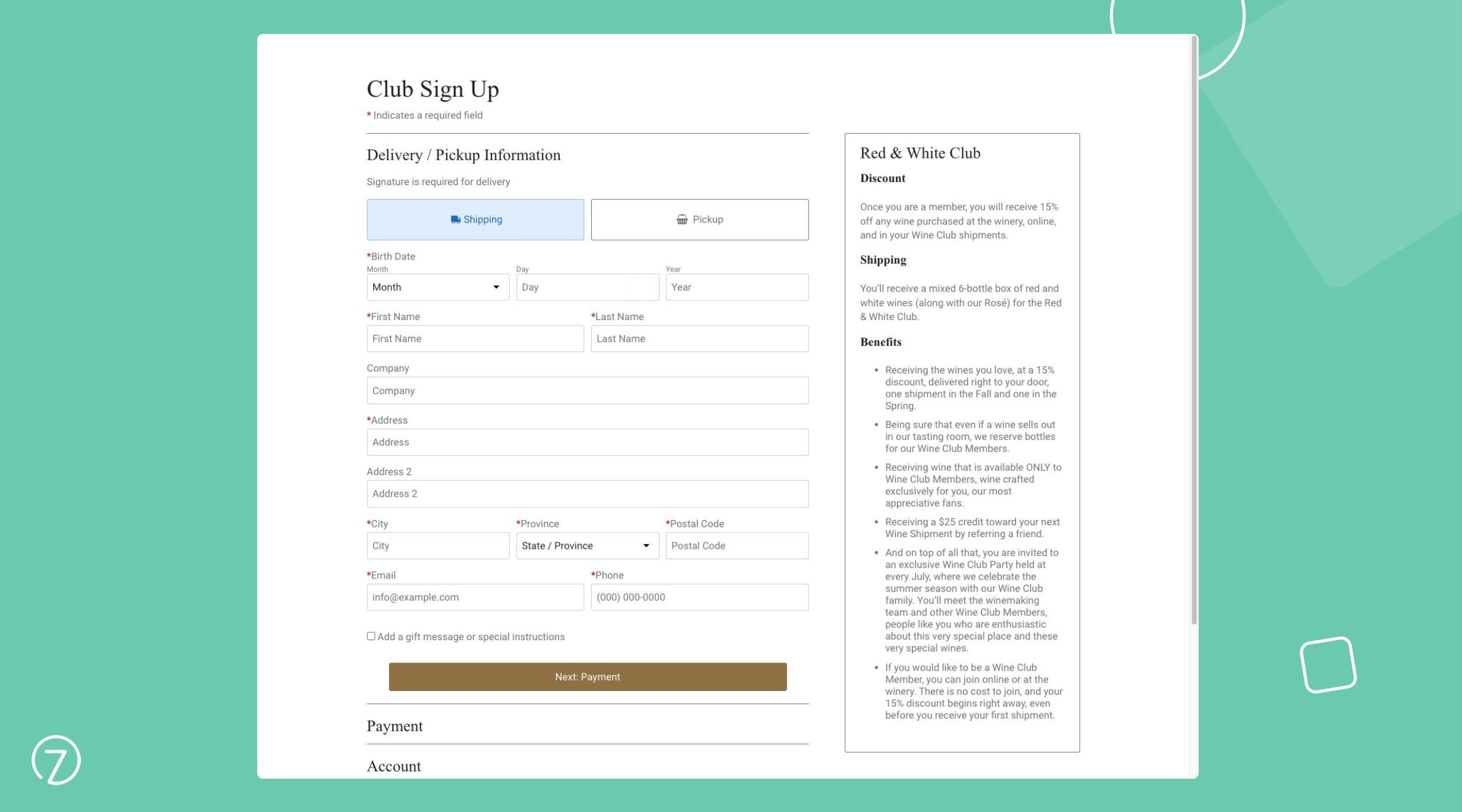
Lastly, while navigating to the payment information stage, users are unexpectedly required to create a password, introducing an additional step that may hinder the signup.
One notable aspect of the signup process is the lack of visual aids throughout each step. Images of the wines, while available, are buried under form fields, and the experience as a whole is missing a visual element for the user. Integrating more obvious visuals could significantly enhance the user experience and make the signup process more engaging and memorable.
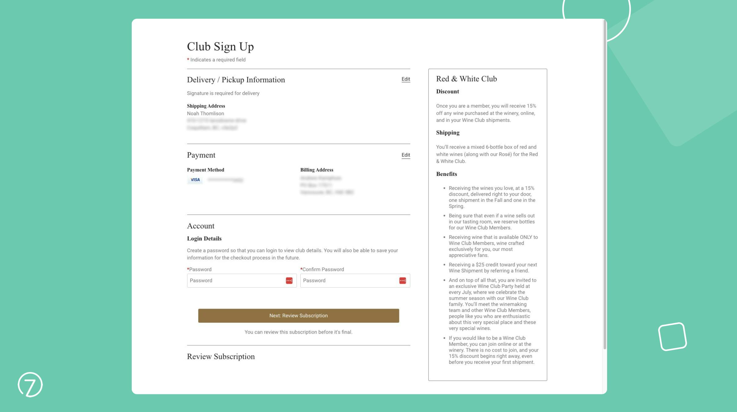
Overall, WineDirect's club signup process provides a functional but somewhat cumbersome experience, with room for improvement in terms of user-friendliness and efficiency. While there are some strong elements, with some adjustments to streamline the process and enhance user experience, WineDirect could offer a smoother and more engaging signup process for potential members.
Commerce7
Commerce7 offers a seamless and engaging club signup experience that prioritizes user satisfaction and convenience – this specific example is of their Subscription Club signup. Unlike traditional signup processes, Commerce7 starts with the product, and conveniently allows users to select the wines they want included in their package. Not only that, but potential members will also automatically see the discount they’ll receive when they join, incentivizing them to continue with the signup process.

Following this, new users are prompted to enter their email address, the only mandatory field in this step, simplifying the process and reducing friction. Alternatively, new users also have the option to checkout using Google Pay and Apple Pay options, facilitating a one-click signup process that eliminates the need for them to enter their email address altogether. If the user is an existing customer, they will have all of their information automatically pre-filled facilitating a similar one-click checkout experience.
In addition, a visual outline of their club selections, and reminder of the convenience that comes with joining the club is displayed on the right hand side of the screen, and remains there throughout the remainder of the signup process. This is a great way to keep potential members informed and excited about joining the club to ensure they follow through with their signup.
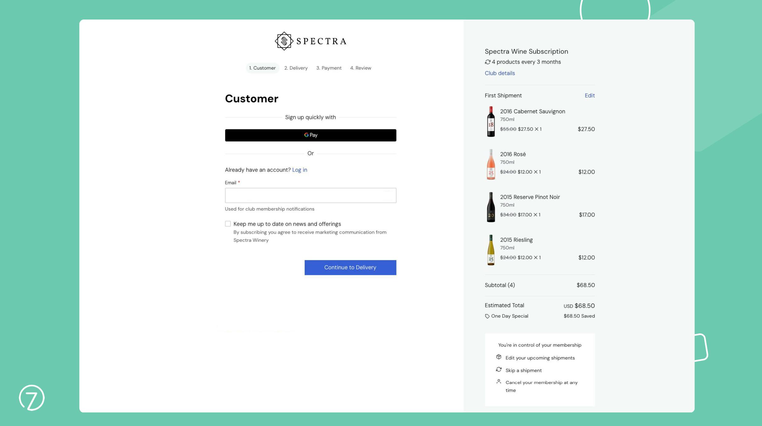
If the user does choose to enter their email address in the previous step, the subsequent shipping information stage requests only essential details, with just five mandatory fields and a single checkbox for age verification, ensuring a hassle free user experience.
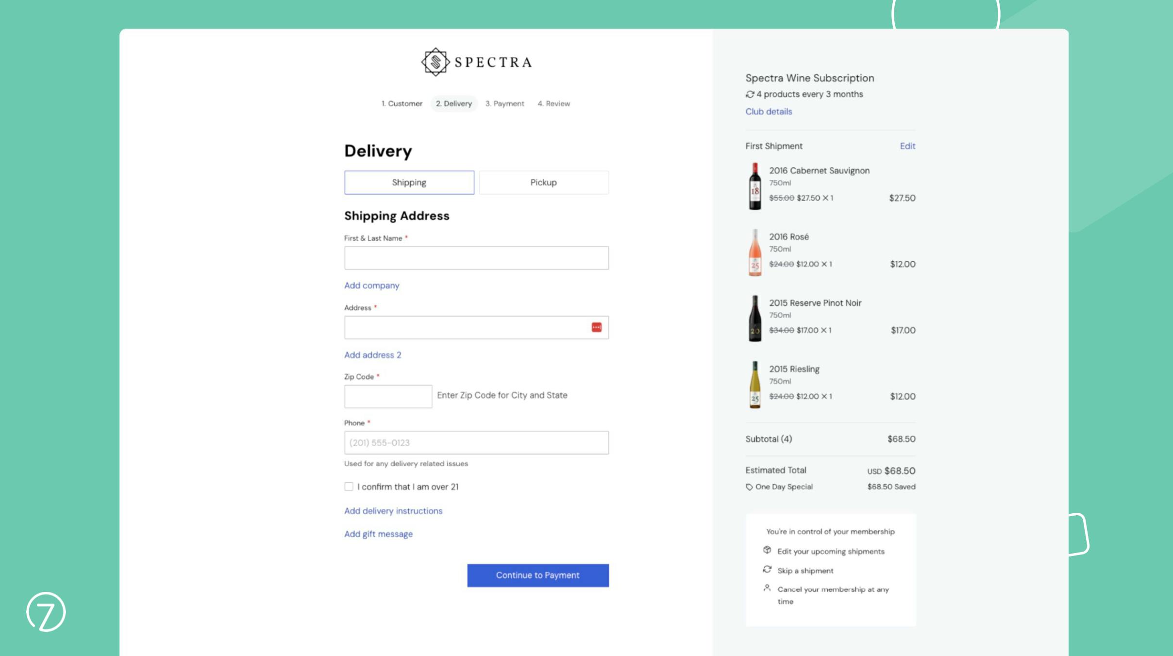
Once all of the required information is filled out, users will arrive on a final review page that gives them an overview of their membership prior to completing their signup.
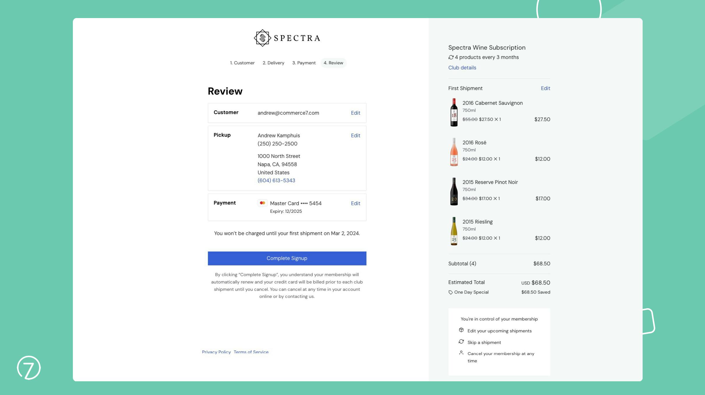
Overall, with a user-centric approach and commitment to convenience, Commerce7 offers an ideal club signup experience.
OrderPort, WineDirect and Commerce7 all have their unique strengths, offering their own sets of features and functionalities. What works best for one winery may not necessarily be the ideal choice for another, however when it comes to the club signup process Commerce7’s approach does stand out. While OrderPort and WineDirect provide functional solutions, there are areas where they could improve to enhance the user experience and overall efficiency when it comes to club sign ups.
Remember, the process of signing up for a wine club can greatly impact the experience as a whole for potential members. It serves as the initial interaction with your brand and sets the tone for their entire membership journey. So, it's essential to prioritize a convenient, user-friendly and seamless signup process to create a positive first impression and eliminate any potential barriers that could result in an abandoned sign up.
Ready to create better shopping experiences?
See Commerce7 firsthand by scheduling a demo with our team.
Schedule a Demo